What's new?
This week brings a number of bug fixes and a slew of improvements to how we display experience bars. We have also added an additional color indicator for enemy difficulty indicators to help players differentiate between different lower level mobs.
Bug fixes / improvements:
Experience Bar & Skills UI Updates
This week brings a few updates to how our experience bars work. Previously, the blue fill showed your progress towards 50 while the red line showed your progress through your current level. Except for the experience bar below your action bar which where the blue fill showed your progress through your current level? What kind of consistency is this?! I have no idea who thought this was a good idea (it was me), but it's time to right the ship!
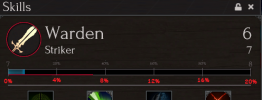
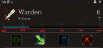
From this point forward the blue fill will always represent progress through your current level. The red line on the other hand, will now represent your progress through your current 20% segment. As you will see in the below screenshots, each experience bar is now split into 5x 20% segments. This red line should now give you a much more visible idea of your progress; especially at higher levels.
Next up we have a few minor improvements to the Skills UI and how it displays experience bars. Instead of showing 2x experience bars with identical information, the specialization experience bar will only be shown when your specialization level differs from your base role level.

(Left: base and spec are different levels so 2 separate experience bars are shown. Right: base and spec are the same level so only 1 experience bar is shown)
We have also added the red line and 5x 20% segments to the action bar's experience bar!

Works in progress:
To see a full list of what is currently in progress head on over to this thread. I will do my best to update this list on a weekly basis and highlight the differences from the previous week with bold font. Note that what is listed here and in the linked post is not necessarily everything that is currently in progress. Below I will highlight some of the upcoming changes in more detail.
QoL Improvements (1 week)
Next week should bring a few highly requested quality of life improvements to the game. Here is a quick preview:
Our active defense revamp has gone through the design phase and a few more kinks are being worked on before we bring it to live. There are no current threat adjustments to avoid/block/parry as those will come after this first iteration. With any luck however, the core revamp of their functionality will be ready for next week.
Hair Improvements (1-2 weeks)
A few weeks back I had mentioned that our artists were working on improvements to the hair system to avoid visual anomalies and we are finally ready to share some of that progress. The screenshot below shows the current system on the left, and the new hair on the right. The biggest change is that we are moving away from transparent materials as they cause all sorts of issues with lighting and colors at certain times of the day. In this particular shot you can see through the hair and overall it just looks kind of odd (this effect is less pronounced with darker hair colors). In the right screenshot the hair is no longer transparent and is more well defined. The eyebrows can come off a bit "strong" right now and is something we will continue working on; although it's less of an issue when the camera isn't in your character's face.

(forgive the minor lighting differences; I assure you this is the same character)
Stat Normalization / Itemization improvements (3-4 weeks)
We are working on "normalizing" some stats so that they can be more easily compared to one another (the main offender here is the discrepancy between DMG, HIT, and PEN). The general goal is to make stats such as +1dmg roughly equal to +1hit or +1pen so that comparisons can more easily be made between items. This change will also allow us to more accurately balance items moving forward. This type of change requires us to make some stat changes to a number of items so expect some further testing...
New QA Server (next month)
We continue working on getting the new QA server up and running on a cloud service. The benefit of this is two fold: a QA environment that players will be able to help us test pending changes and in the event of an emergency we will be ready to spin up a new live service relatively quickly on the cloud servers. The main goal is to move our weekly patches to QA for proper testing internally and with the community. Then once we have had the appropriate amount of time to iterate on changes they would be pushed to live once a month.
Patch Size (ongoing)
This task has been bumped a little in priority but is still ongoing.
Known Issues:
This week brings a number of bug fixes and a slew of improvements to how we display experience bars. We have also added an additional color indicator for enemy difficulty indicators to help players differentiate between different lower level mobs.
Bug fixes / improvements:
- Tech
- Fixed: nav mesh link creation for ladders. This should resolve issues of NPCs not properly taking ladders in places like Exile Freehold.
- Fixed: specializations will no longer "catch up" when they reach the same level as your base role. This is no longer needed now that specs get an experience bonus - they will catch up naturally as experience is earned.
- Previously if your spec reached your base role's level then it would "catch up" in experience so that they were dead even. For example: if your base role is 20.9 (about to hit 21) and your spec is 19, if your spec catches your base role and gets to level 20.0 it would have jumped to 20.9 (bypassing 90% of level 20). Now that specs gain experience at a faster rate this was no longer necessary.
- Environment / Art
- Fixed: environmental bugs and props in Redshore Ridge & Exile Freehold. Nav meshes rebaked.
- Fixed: reduced the max range on cloud shadows so that they are more refined (they were set way too high). There is still work to do here.
- Fixed: trees in the Meadowlands' wolf<-->spider canyon no longer wiggle
- UI:
- Added: "/utctime" command to display the current UTC time.
- Added: "/servertime" command to display the current time in the server's timezone (CST)
- Fixed: adventuring role tab is always above gathering & crafting tabs in the Skills UI
- Adjusted experience bars in the Skills UI and Action bar. See below for a more details.
- Removed the "Disable Camera Collision Smoothing" toggle from Gameplay Options
- Added a toggle to disable world-space context menus for players in Gameplay Options
- Added an additional color indicator for lower level creatures. Greens spanning from 3 to 10 levels below you did not provide enough nuance to allow for the distinction between a very low green and a higher level green. A light blue color has been added that covers 3 to 5 levels below you. The color ordering is now as follows:
- Gray: 10+ levels below you
- Green: 6-10 levels below you
- Light Blue: 3-5 levels below you
- Blue: 1-2 levels below you
- White: Equal level
- Yellow: 1-2 levels above you
- Red: 3+ levels above you
- Added: upside down chevron for 0 chevron NPCs (ants from anthills and rats from rat nests) to indicate that they do not give experience.
- Chevron indicators are now larger ~33% larger on the UI and ~16% larger on world space nameplates
- NPC dialog choices are now blocked when the rewards window is open to prevent conversation progression until the reward is selected.
- Design:
- Fixed yield of Ramie Patch (Dense Ramie)
- Fixed material level for level 40 Topaz.
- Increased 3-chevron density of Dryfoot Stronghold
- Slight increase in experience for lower level mobs (greens & light blues)
- Chaos Hatchet: Replaced HIT modifier with a larger damage range.
Experience Bar & Skills UI Updates
This week brings a few updates to how our experience bars work. Previously, the blue fill showed your progress towards 50 while the red line showed your progress through your current level. Except for the experience bar below your action bar which where the blue fill showed your progress through your current level? What kind of consistency is this?! I have no idea who thought this was a good idea (it was me), but it's time to right the ship!
From this point forward the blue fill will always represent progress through your current level. The red line on the other hand, will now represent your progress through your current 20% segment. As you will see in the below screenshots, each experience bar is now split into 5x 20% segments. This red line should now give you a much more visible idea of your progress; especially at higher levels.
Next up we have a few minor improvements to the Skills UI and how it displays experience bars. Instead of showing 2x experience bars with identical information, the specialization experience bar will only be shown when your specialization level differs from your base role level.

(Left: base and spec are different levels so 2 separate experience bars are shown. Right: base and spec are the same level so only 1 experience bar is shown)
We have also added the red line and 5x 20% segments to the action bar's experience bar!

Works in progress:
To see a full list of what is currently in progress head on over to this thread. I will do my best to update this list on a weekly basis and highlight the differences from the previous week with bold font. Note that what is listed here and in the linked post is not necessarily everything that is currently in progress. Below I will highlight some of the upcoming changes in more detail.
QoL Improvements (1 week)
Next week should bring a few highly requested quality of life improvements to the game. Here is a quick preview:
- Chat tab close button moved to the tab's context menu
- Window lock states will persist through sessions.
- Map window will show the zone name in the title bar
- Executing abilities or consumables while sitting will cause your character to stand.
Our active defense revamp has gone through the design phase and a few more kinks are being worked on before we bring it to live. There are no current threat adjustments to avoid/block/parry as those will come after this first iteration. With any luck however, the core revamp of their functionality will be ready for next week.
Hair Improvements (1-2 weeks)
A few weeks back I had mentioned that our artists were working on improvements to the hair system to avoid visual anomalies and we are finally ready to share some of that progress. The screenshot below shows the current system on the left, and the new hair on the right. The biggest change is that we are moving away from transparent materials as they cause all sorts of issues with lighting and colors at certain times of the day. In this particular shot you can see through the hair and overall it just looks kind of odd (this effect is less pronounced with darker hair colors). In the right screenshot the hair is no longer transparent and is more well defined. The eyebrows can come off a bit "strong" right now and is something we will continue working on; although it's less of an issue when the camera isn't in your character's face.

(forgive the minor lighting differences; I assure you this is the same character)
Stat Normalization / Itemization improvements (3-4 weeks)
We are working on "normalizing" some stats so that they can be more easily compared to one another (the main offender here is the discrepancy between DMG, HIT, and PEN). The general goal is to make stats such as +1dmg roughly equal to +1hit or +1pen so that comparisons can more easily be made between items. This change will also allow us to more accurately balance items moving forward. This type of change requires us to make some stat changes to a number of items so expect some further testing...
New QA Server (next month)
We continue working on getting the new QA server up and running on a cloud service. The benefit of this is two fold: a QA environment that players will be able to help us test pending changes and in the event of an emergency we will be ready to spin up a new live service relatively quickly on the cloud servers. The main goal is to move our weekly patches to QA for proper testing internally and with the community. Then once we have had the appropriate amount of time to iterate on changes they would be pushed to live once a month.
Patch Size (ongoing)
This task has been bumped a little in priority but is still ongoing.
Known Issues:
- The launcher my randomly say you have an update when no update exists. Restarting the launcher typically resolves the issue and allows you to launch the game normally. We are looking into the cause.
- Resource nodes may occasionally tell you "invalid target". This means that your client thinks a resource node is there but the server does not. We are still investigating the cause of this.
- Occasionally a loot roll may be skipped entirely and a carcass will be given. When this happens please provide any relevant details as we are still trying to track this one down.
- Deconstructing crafted items returns junk 100% of the time.
- Not all clothing/armor has visuals
- Dragging a group-nameplate in the group window will set the wrong pivot point for the group window and the whole thing will drag a bit weird.
- Typing chat text may occasionally become invisible. Unfocus your chat window and trying again a few times typically resolves this.
- Sometimes when you respawn you don't end up at the proper Hallow --> if this happens please report the position where you died via the "/report" command or "/debugposition" (if using debugposition you'll need to paste the value here)
- MacOS:
- Zooming the camera while holding the right mouse button can cause your chat window to scroll. This is not intended behavior.
- At some camera angles the sun may go dark. This should not happen frequently but is readily reproducible at some locations. Investigating a fix.
Last edited:


